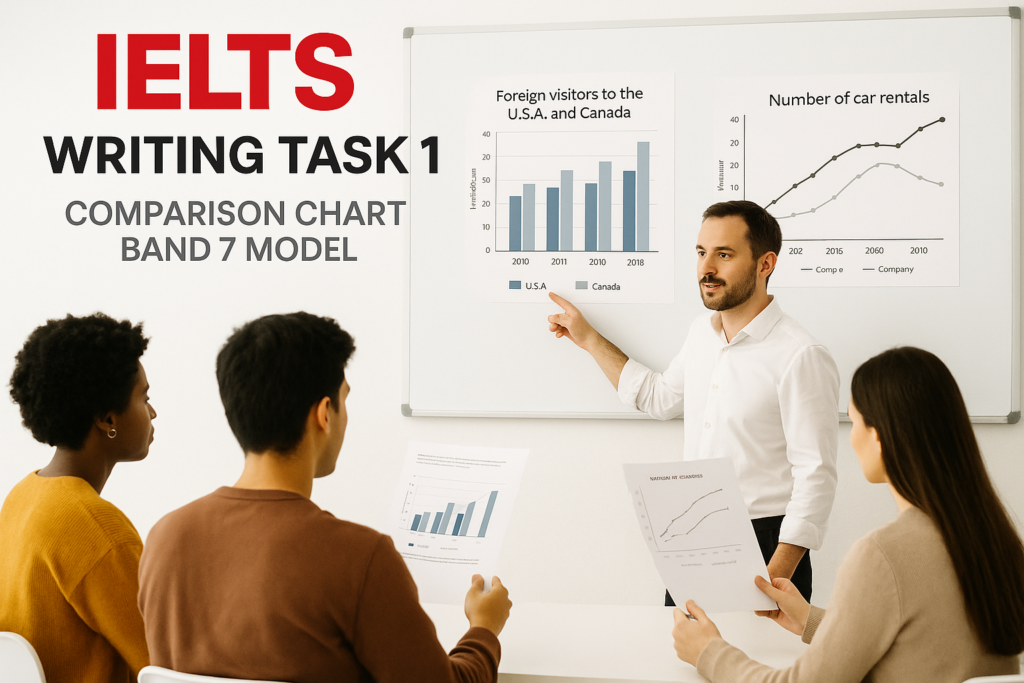
IELTS Writing Task 1 Comparison Chart band 7 model is for Academic IELTS candidates who can describe data but find it difficult to compare categories clearly. A comparison chart may be a bar chart, table, line graph, or paired visual where the main task is not just reporting numbers. Your score depends on whether you can identify the biggest similarities, differences, highs, lows, and grouped patterns without turning the report into a list. Before you write another practice answer, take the IELTS Express Pre-Test to check your current Writing band range and see whether overview quality, comparison control, grammar, vocabulary, or timing is holding you back.
In this guide, you will see a complete Band 7 comparison chart model answer and the thinking behind it. The aim is not to memorise one report. The aim is to learn a repeatable method: read the chart, decide what is worth comparing, group the details, write a clear overview, and support the main message with accurate figures.
What Band 7 Means For A Comparison Chart
Band 7 in Writing Task 1 usually means the report presents the main features clearly, includes a clear overview, organises information logically, and uses a good range of language with mostly accurate control. For comparison charts, the examiner wants to see that you can compare, not just mention. That means your answer should show relationships between figures.
A weaker answer describes one category, then another category, then another category. A stronger answer groups the chart by pattern. It may compare the two highest categories first, contrast the smallest categories next, and then mention one meaningful exception. This is what makes the writing sound analytical while still staying factual.
- Find the highest and lowest figures before writing.
- Group similar categories instead of listing every bar or cell.
- Write one overview that captures the main contrast.
- Use figures only when they support a comparison.
- Keep sentence grammar controlled and formal.
The Band 7 Comparison Chart Structure
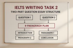
A reliable comparison chart report has four short paragraphs. The first paragraph paraphrases the task. The second gives the overview. The third explains the largest or most important comparison. The fourth covers the remaining key details, especially contrasts, smaller categories, or exceptions.
This structure works because it gives the examiner the main message early. The body paragraphs then prove that message with selected data. You do not need to cover every number if the chart is crowded. You need to choose the numbers that make the pattern clear.
For wider Task 1 practice, use the IELTS Writing Task 1 practice test after studying this model so you can apply the same structure to tables, line graphs, pie charts, bar charts, and mixed charts.
Sample IELTS Comparison Chart Task
Imagine the chart compares the percentage of students at three Australian colleges who used four IELTS support services in 2025. At College A, writing workshops were used by 46% of students, speaking practice by 32%, reading clinics by 14%, and listening labs by 28%. At College B, the figures were 38%, 35%, 21%, and 26% respectively. At College C, speaking practice led with 44%, followed by writing workshops at 30%, listening labs at 24%, and reading clinics at 18%.
This task is typical because the chart contains many figures, but the main story is simple. Writing workshops were strongest at Colleges A and B, speaking practice was strongest at College C, and reading clinics were the least used service across all three colleges. A Band 7 report should make those comparisons easy to see.
Band 7 Model Answer
The chart compares the proportion of students at three Australian colleges who used four IELTS support services in 2025.
Overall, writing workshops were the most popular service at Colleges A and B, whereas speaking practice ranked first at College C. Reading clinics were the least used option at every college, while listening labs attracted a moderate share of students in all three institutions.
At College A, writing workshops had the highest participation rate, at 46%, which was eight percentage points above the figure for College B and sixteen points higher than College C. Speaking practice was also used by almost a third of students at College A, at 32%, although this was lower than the figures for College B and College C, at 35% and 44% respectively.
College C showed the clearest preference for speaking practice, which reached 44% and was well ahead of its writing workshop figure of 30%. By contrast, reading clinics recorded the lowest percentages in all three colleges, ranging from 14% at College A to 21% at College B. Listening labs were more consistent, with figures of 28%, 26%, and 24% across Colleges A, B, and C.
Why This Model Reaches Band 7
The model reaches Band 7 because it does not march through the chart mechanically. It gives a clear overview, then organises the detail around useful comparisons. The reader can immediately see which services led at each college and which service was weakest overall.
The answer also uses data selectively. It includes the figures that prove the main comparisons, such as 46% for writing workshops at College A and 44% for speaking practice at College C. It also uses a range of comparison language without becoming unnatural.
If you want to practise this under exam pressure, access unlimited IELTS mock tests and check whether your Task 1 reports include a real overview and grouped body paragraphs.
How To Read A Comparison Chart Quickly
Start with the labels. Read the title, categories, units, and time period before looking closely at the numbers. If the chart uses percentages, your language will be different from a chart using raw numbers, dollars, or student totals.
Next, identify the leaders and the weakest areas. In many comparison charts, the highest and lowest figures give you the core of the overview. Then look for repeated patterns. Are two categories close together? Does one group behave differently from the others? Is one category consistently high or low?
Finally, decide how to group the details. You might group by category, by institution, by high and low figures, or by similarities and differences. The best grouping is the one that makes the comparison easiest to follow.
Writing A Strong Overview
The overview should summarise the main comparison without drowning in detail. For the sample chart, the overview mentions the leading services at each college, the consistently low position of reading clinics, and the steady middle position of listening labs.
A weak overview says there were differences between the colleges. That is true, but it is too general. The examiner needs to know what the differences were. A useful overview names the pattern, not just the existence of a pattern.
You can write the overview in two sentences. The first sentence can report the highest or dominant categories. The second can mention the lowest category or a broad similarity. This gives the report a strong spine before the detailed figures appear.
Choosing Details For Body Paragraphs
Good detail selection is one of the easiest ways to improve a comparison chart answer. Choose figures that prove the overview. If the overview says writing workshops were most popular at Colleges A and B, include those figures. If it says reading clinics were least used, include the range or the main low figures.
You do not need to include every number just because it is visible. More data can make your report less clear if the comparisons are not organised. A Band 7 answer is selective, but it is not vague. It uses enough figures to support the main story.
For more help with selection and paragraph planning, read the IELTS Writing Task 1 tips and strategies guide before your next practice report.
Comparison Vocabulary For Band 7
Band 7 vocabulary should be accurate and flexible. Useful phrases include higher than, lower than, the highest proportion, the lowest figure, slightly above, considerably below, almost the same as, twice as high as, and ten percentage points higher.
Be careful with percentage points. If one figure is 46% and another is 38%, the first is eight percentage points higher. It is not simply eight percent higher. If you are unsure, write was higher than or was considerably higher than. Accuracy is more valuable than risky precision.
Do not overuse advanced phrases. A clear sentence with while, whereas, compared with, and respectively can score well if the grammar is correct. The best Task 1 vocabulary usually sounds controlled, not decorated.
Grammar Patterns That Help Your Score
Comparison charts give you useful opportunities to show range. You can write: Writing workshops were most popular at College A, whereas speaking practice ranked first at College C. This sentence compares two institutions cleanly.
You can also use relative clauses. For example: Reading clinics, which attracted only 14% of students at College A, were the least used service in the chart. This adds detail without starting a new sentence for every number.
Keep long sentences under control. If you try to compare four categories in one sentence, the grammar may collapse. Two linked comparisons are usually enough. Strong Task 1 writing is compact and accurate.
Common Comparison Chart Mistakes
The first mistake is listing the data in chart order with no grouping. This makes the report sound like notes rather than a summary. The second mistake is missing the overview. Without a clear overview, Task Achievement is limited even if the figures are mostly accurate.
The third mistake is describing categories without comparing them. If you write that College A had 46% and College B had 38%, add what that means: College A was higher by eight percentage points. The fourth mistake is adding reasons that are not shown in the chart. IELTS Task 1 asks you to describe data, not explain why students made a choice.
If timing is a repeated weakness, see our IELTS preparation plans and choose support that helps you build a realistic Writing routine.
A 20-Minute Practice Routine
Spend the first two minutes reading the title, labels, units, and categories. Spend another two minutes choosing the overview and grouping the details. Then write the introduction and overview before starting the body paragraphs.
Use about twelve minutes for the detail paragraphs. Each paragraph should have a job. One might compare the leading services. The other might compare the weakest services and the most stable category. Do not stop to search for rare vocabulary during the exam.
Save the final two minutes for checking. Look for wrong figures, articles, plural nouns, subject-verb agreement, comparison forms, and repeated sentence openings. A short check can protect marks you have already earned.
Final Checklist Before You Submit
Before you finish a comparison chart report, check that the introduction paraphrases the task, the overview gives the main pattern, the body paragraphs are grouped logically, and the selected figures support the overview.
Also check that you compared categories directly, avoided personal opinions, used units accurately, and did not repeat the post title as a body heading. A comparison chart answer should be selective, formal, and easy to follow.
An IELTS Writing Task 1 Comparison Chart band 7 model is useful only if you copy the thinking behind it. Find the main contrast, group the data, support the overview with accurate figures, and write in clean controlled English.
Ready to find out your IELTS band score?
Take the IELTS Express Pre-Test for just $4.99 and get your personalised band prediction with a 14-day improvement plan.
FAQ: IELTS Writing Task 1 Comparison Chart Band 7 Model
How do I write a Band 7 IELTS comparison chart answer?
Use a four-paragraph report: introduction, overview, first detail paragraph, and second detail paragraph. Identify the main similarities and differences first, then support them with selected figures.
Should I include every number from the chart?
No. Include the figures that prove the main comparisons. A strong answer usually includes the highest figures, lowest figures, and one or two meaningful contrasts rather than every minor value.
What should the overview include?
The overview should name the biggest pattern in the chart, such as the highest category, the lowest category, and any clear similarity or contrast across the groups.
What vocabulary helps with comparison charts?
Useful language includes higher than, lower than, whereas, while, compared with, respectively, percentage points, the highest proportion, and the lowest figure.
How long should an IELTS Task 1 comparison answer be?
In the exam, a strong answer is usually around 170 to 200 words. It should be long enough to include a clear overview and selected details, but not so long that it becomes repetitive.