IELTS Writing Task 1 Mixed Charts band 7 model is for Academic IELTS candidates who can understand each chart separately but lose control when two visuals appear in the same task. Mixed charts may combine a bar chart with a line graph, a pie chart with a table, or a map-style diagram with numerical data. Your score depends on whether you can find one clear overall message, group the information sensibly, and compare only the details that matter. Before you write another practice answer, take the IELTS Express Pre-Test to check your current Writing band range and see whether overview quality, selection, grammar, vocabulary, or timing is holding you back.
In this guide, you will see a complete Band 7 mixed charts model answer and the thinking behind it. The aim is not to memorise one response. The aim is to learn a repeatable method: read both visuals, decide which chart carries the main trend, connect the visuals in the overview, and write a calm report that sounds selective rather than crowded.
What Band 7 Means For Mixed Charts
Band 7 in Writing Task 1 usually means the answer presents the main features clearly, includes a clear overview, organises information logically, and uses a good range of vocabulary and grammar with mostly accurate control. For mixed charts, the examiner also wants to see that you can manage two sources of information without treating them as two unrelated mini essays.
The biggest Band 7 skill is deciding what the reader needs first. A weaker answer describes the first chart, then the second chart, with no connection between them. A stronger answer explains the shared story. It may show that one category increased while another declined, that spending patterns changed over time, or that one chart explains the distribution behind another trend.
- Read both visuals before writing anything.
- Find the common subject, time frame, and units.
- Write one overview that covers both charts.
- Group details by pattern, not by visual order alone.
- Use figures only when they prove the main comparison.
The Band 7 Mixed Charts Structure
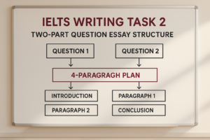
A reliable mixed charts report has four short paragraphs. The first paragraph paraphrases the task. The second gives a combined overview. The third describes the most important trend or chart. The fourth compares the remaining key details from both visuals. This structure gives the answer control without forcing every number into the report.
You can describe one visual in each body paragraph if the task is naturally split that way, but do not let the answer become disconnected. Each paragraph should still support the same overview. If a bar chart shows total enrolments and a pie chart shows reasons for study, the report should connect the size of the groups with their main motivations where possible.
For wider Task 1 practice, use the IELTS Writing Task 1 practice test after studying this model so you can apply the same system to line graphs, tables, maps, pie charts, and process diagrams.
Sample IELTS Mixed Charts Task
Imagine the task includes a line graph showing the number of international students at three Australian colleges from 2020 to 2025, and a pie chart showing the main reason those students chose their college in 2025. College A rose from 800 to 1,400 students, College B increased from 600 to 900, and College C fell slightly from 1,000 to 850. In the pie chart, 40% of students chose their college for course quality, 25% for location, 20% for fees, and 15% for recommendations.
This task is typical because the two visuals are connected but not identical. The line graph shows change over time, while the pie chart explains the final-year decision pattern. A Band 7 answer should not list every year or every pie segment mechanically. The main story is that College A grew fastest and became the largest provider by 2025, while course quality was the dominant reason students selected a college.
Band 7 Model Answer
The line graph compares the number of international students at three Australian colleges between 2020 and 2025, while the pie chart shows the main reasons students chose their college in 2025.
Overall, College A experienced the strongest growth and became the largest of the three colleges by the end of the period, whereas College C declined slightly. In 2025, course quality was the most common reason for choosing a college, followed by location and fees.
In 2020, College C had the highest number of international students, at 1,000, compared with 800 at College A and 600 at College B. However, College A then increased steadily, reaching 1,400 students in 2025. College B also grew, although more moderately, from 600 to 900 students over the same period.
By contrast, College C moved in the opposite direction, falling from 1,000 students to 850 by 2025. The pie chart suggests that academic factors were especially important in the final year, as course quality accounted for 40% of student choices. Location represented a further 25%, while fees and recommendations made up smaller shares, at 20% and 15% respectively.
Why This Model Reaches Band 7
The model reaches Band 7 because it controls both visuals without overloading the reader. The overview connects the charts by naming the biggest enrolment change and the leading reason for college choice. It does not waste space listing every data point.
The body paragraphs are also organised by pattern. The first detail paragraph compares the starting positions and the two increases. The second paragraph contrasts College C with the rising colleges, then summarises the pie chart in ranked order. This creates a clear path through the information.
If you want to practise this under exam pressure, access unlimited IELTS mock tests and check whether your mixed chart reports include one combined overview and selective supporting data.
How To Read Mixed Charts Quickly
Start by identifying the relationship between the visuals. Ask whether they show the same topic from different angles, different time periods, or different units. If they are directly connected, your overview should connect them. If they are only loosely connected, your overview should still mention the biggest feature from each visual.
Next, identify which visual needs more explanation. A line graph usually needs trend language, while a pie chart often needs proportion and ranking language. A table may need careful selection because it can contain many figures. A diagram may need sequencing language. Mixed charts test whether you can switch language accurately without losing structure.
Finally, decide what to ignore. In most mixed chart tasks, there is more information than you can describe well in 20 minutes. Band 7 answers are selective. They include the highest, lowest, biggest increase, biggest fall, and one or two meaningful comparisons. They do not mention every minor fluctuation.
Writing A Strong Overview
A strong mixed charts overview summarises both visuals in two sentences. It should name the biggest trend in the graph or table and the largest category in the second visual. If there is a clear contrast, include it. If one chart explains the other, make that connection clear.
For the sample task, the overview says that College A grew most strongly and became the largest college, while College C declined slightly. It also says that course quality was the leading reason for student choice. That gives the examiner the whole picture before the details begin.
A weak overview says that there were changes in student numbers and several reasons for choosing colleges. That is too general. The examiner needs to know what changed and which reason mattered most.
Choosing Details For Body Paragraphs
Good detail selection is what keeps a mixed chart answer readable. Choose figures that prove the overview. If the overview says College A grew fastest, include its start and end figures. If it says course quality was the main reason, include the 40% figure and compare it briefly with the next largest categories.
You do not need to mention every year in a line graph or every segment in a pie chart unless the visual is very small. More data does not automatically mean a better answer. In fact, too many figures can make your report harder to follow and can increase the chance of mistakes.
For more help with selecting and grouping information, read the IELTS Writing Task 1 tips and strategies guide before your next practice report.
Mixed Chart Vocabulary For Band 7
Band 7 vocabulary should be precise and flexible. For trends, use rose, increased, climbed, declined, fell, remained stable, reached, and peaked. For proportions, use accounted for, represented, made up, constituted, and formed the largest share. For comparisons, use whereas, while, by contrast, compared with, and respectively.
Be careful with the word dramatic. Do not call a change dramatic unless it is genuinely large. Be careful with percentage points as well. If one share is 40% and another is 25%, the first is fifteen percentage points higher. You can also write that it was considerably higher, which avoids unnecessary mathematical risk.
The best vocabulary in Task 1 is usually simple and accurate. A clear sentence with the right figure is stronger than a long sentence filled with memorised phrases.
Grammar Patterns That Help Your Score
Mixed charts give you useful opportunities to combine trend and comparison grammar. You can write: College A rose from 800 to 1,400 students, while College C declined from 1,000 to 850. This sentence compares two different movements clearly.
You can also use relative clauses to connect information. For example: Course quality, which accounted for 40% of responses, was the most common reason for choosing a college. This adds detail without starting a new sentence for every number.
Keep sentence length under control. Mixed charts tempt candidates to join too many figures with commas. If a sentence becomes hard to read aloud, split it. Accuracy matters more than showing off.
Common Mixed Chart Mistakes
The first mistake is writing two separate reports. Even if the visuals are different, the task is one Task 1 answer. Use one introduction, one overview, and body paragraphs that feel connected.
The second mistake is missing the overview. Without a clear overview, Task Achievement is limited. The overview is even more important in mixed charts because it proves that you understood the relationship between the visuals.
The third mistake is copying too many numbers. Choose the figures that support the main story. The fourth mistake is using the wrong language for the visual. A pie chart does not rise or fall unless it compares different times. A line graph does not account for a share unless it is showing proportions. If timing is a repeated weakness, see our IELTS preparation plans and choose support that helps you build a realistic Writing routine.
A 20-Minute Practice Routine
Spend the first two minutes reading both visuals and identifying the connection between them. Spend another two minutes choosing the overview and deciding which details deserve space. Then write the introduction and overview before moving into the body paragraphs.
Use twelve minutes for the body paragraphs. Keep one paragraph focused on the main trend or largest set of data, and use the other paragraph for contrast or the second visual. Do not stop to search for rare vocabulary. Use accurate trend, proportion, and comparison language.
Save the final two minutes for checking. Look for unit accuracy, tense, articles, plurals, comparative forms, and whether each chart has been mentioned. A short check can protect marks you have already earned.
Final Checklist Before You Submit
Before you finish an IELTS mixed charts report, check that the introduction paraphrases both visuals, the overview covers both charts, the body paragraphs are grouped logically, and selected figures support the main message.
Also check that you used chart-specific language accurately, avoided opinions, did not invent causes, and did not repeat the post title as a body heading. A mixed chart answer should be organised, selective, and easy to follow.
An IELTS Writing Task 1 Mixed Charts band 7 model is useful only if you copy the thinking behind it. Read both visuals together, find the shared story, select the strongest figures, and write in clean controlled English.
Ready to find out your IELTS band score?
Take the IELTS Express Pre-Test for just $4.99 and get your personalised band prediction with a 14-day improvement plan.
FAQ: IELTS Writing Task 1 Mixed Charts Band 7 Model
How do I write a Band 7 IELTS mixed charts answer?
Use one four-paragraph report: introduction, combined overview, first body paragraph, and second body paragraph. Find the relationship between the visuals, select the biggest patterns, and support them with accurate figures.
Should I describe each chart separately?
You can give each chart its own body paragraph if that is clear, but the answer should still feel connected. The overview should cover both visuals and show the main relationship between them.
What should the overview include for mixed charts?
The overview should include the biggest feature from each visual and any clear connection or contrast. It should not list every number or every category.
How many figures should I include?
Include enough figures to prove the main comparisons. A strong answer usually gives the highest, lowest, biggest increase or decrease, and a few supporting values. Avoid copying every minor figure.
How long should a mixed charts answer be?
A strong IELTS Task 1 answer is usually around 170 to 200 words in the exam. For practice guides, explanations can be longer, but the exam answer itself should stay selective and concise.