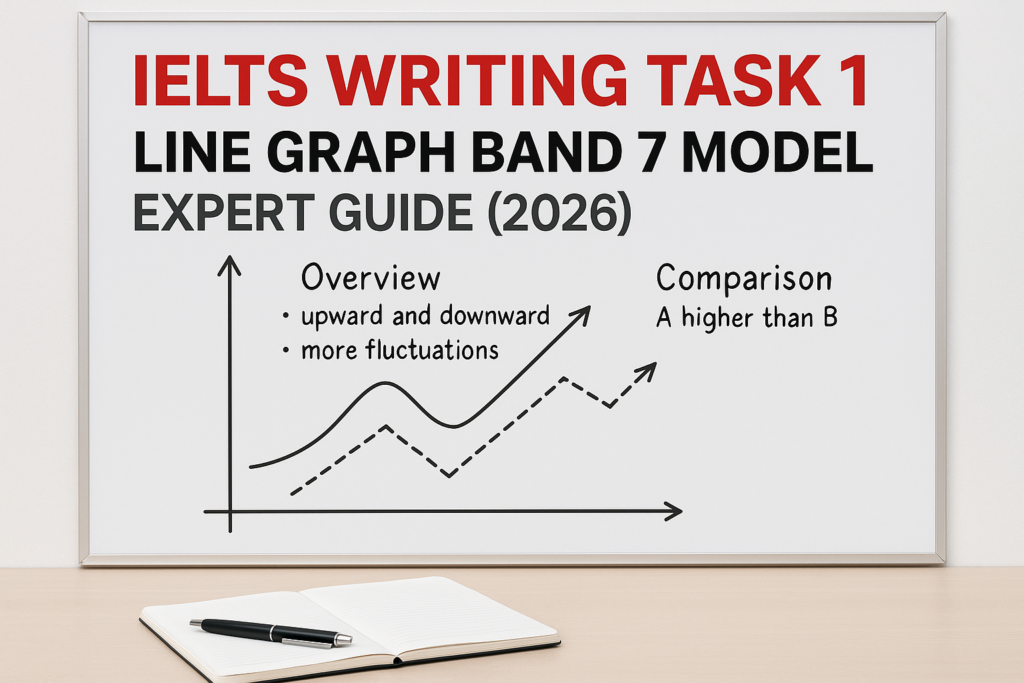
IELTS Writing Task 1 Line Graph band 7 model is for Academic IELTS candidates who can describe a chart but struggle to make the answer sound organised, selective, and genuinely Band 7. A line graph answer is not a list of every number. It is a short report that identifies the main trends, compares the right lines, and uses data only where it supports the message. Before you write another practice report, take the IELTS Express Pre-Test to check your current Writing band range and see whether task achievement, overview quality, vocabulary, grammar, or timing is holding you back.
In this guide, you will see how a Band 7 line graph response is built from the question up. The goal is not fancy language. The goal is a clear overview, logical grouping, accurate comparisons, and flexible sentence control. If you can repeat that process under time pressure, line graphs become far less stressful.
What Band 7 Means For A Line Graph
Band 7 in Writing Task 1 usually means the report covers the main features clearly, presents a clear overview, organises information logically, and uses a range of vocabulary and grammar with good control. You do not need perfect language, but the examiner should never feel lost.
For line graphs, the biggest difference between Band 6 and Band 7 is selection. A Band 6 answer may describe too many figures in order. A Band 7 answer chooses the important movement: what rose, what fell, what stayed stable, what finished highest, what changed fastest, and where two lines crossed or moved in opposite directions.
- Write a clear overview after the introduction.
- Group lines by similar or contrasting trends.
- Use data to support comparisons, not replace them.
- Avoid describing every single year or point.
- Use trend vocabulary accurately and naturally.
The Band 7 Line Graph Structure
A reliable line graph report has four short paragraphs. Paragraph one paraphrases the task. Paragraph two gives the overview. Paragraph three describes the first main group of data. Paragraph four describes the second main group or the key contrast.
This structure works because it makes your answer easy to mark. The examiner sees the overview early, then follows your comparisons without having to search for the main idea. It also stops you from writing a long chronological story where each sentence begins with then or after that.
For broader Task 1 practice, use the IELTS Writing Task 1 practice test after studying this model so you can apply the structure to tables, bar charts, maps, and mixed charts.
Sample Line Graph Task
Imagine the line graph shows the percentage of people using three transport methods in a city from 2000 to 2020: private cars, public transport, and bicycles. Cars begin at 60 percent in 2000 and fall gradually to 45 percent in 2020. Public transport rises from 25 percent to 35 percent. Bicycles increase from 5 percent to 20 percent, with the sharpest rise after 2010.
This is a typical IELTS-style pattern because the graph contains several trends, not just one. A weak answer would list each transport type year by year. A stronger answer would identify the overall fall in car use, the growth in public transport and cycling, and the especially sharp increase in bicycle use in the second half of the period.
Notice that you do not need every number. You need starting points, ending points, and one or two useful middle details where the trend changes.
Band 7 Model Answer
The line graph compares the proportion of people using cars, public transport and bicycles in a city between 2000 and 2020.
Overall, car travel remained the most common form of transport throughout the period, although its share declined steadily. By contrast, both public transport and bicycle use became more popular, with cycling showing the fastest growth, particularly after 2010.
In 2000, private cars accounted for 60% of transport use, which was more than double the figure for public transport, at 25%. Car use then fell gradually to 55% in 2010 before dropping further to 45% by 2020. Despite this decline, it still represented the largest share at the end of the period.
Public transport followed the opposite trend, rising from 25% in 2000 to 30% in 2010 and 35% in 2020. Bicycle use also increased, but more sharply. It stood at only 5% at the beginning, doubled to 10% by 2010, and then climbed to 20% in 2020. This means cycling quadrupled over the twenty-year period, although it remained less common than the other two modes.
Why This Model Reaches Band 7
The model answer works because the overview is clear and separate. It tells the examiner the main story before the details begin: cars fell but stayed highest, while public transport and bicycles rose. That is exactly what a line graph overview should do.
The body paragraphs are also grouped logically. One paragraph focuses on cars, and the other compares public transport with bicycles. This is better than jumping from year to year because the reader can follow each trend from beginning to end.
The data is selective. The answer uses key figures from 2000, 2010, and 2020, but it does not drown the report in numbers. If you want to test this skill under exam pressure, access unlimited IELTS mock tests and review whether your Task 1 answers include a real overview and grouped comparisons.
How To Write The Introduction
The introduction should paraphrase the task in one sentence. You do not need to be creative. Replace words carefully: shows can become compares, percentage can become proportion, and from 2000 to 2020 can become between 2000 and 2020.
A good introduction does not include trends. Save the main trends for the overview. If your first paragraph already says that cars decreased while cycling increased, your overview may become repetitive or too thin.
Keep the introduction short. In a 20-minute task, a clean sentence is better than a long paraphrase with grammar mistakes.
How To Write The Overview
The overview is the most important paragraph in a line graph answer. It should describe the main pattern without too many numbers. Ask yourself four questions: which line was highest overall, which line changed most, which line increased or decreased, and whether any lines crossed or moved in opposite directions.
For the sample task, the overview should mention that car use declined but remained the most popular option, while public transport and cycling increased. It should also mention that cycling grew fastest. Those points cover the main picture.
Avoid tiny details in the overview. Do not write every year or exact percentage there. The overview is the map; the body paragraphs are where you prove it with selected figures.
Choosing Details For Body Paragraphs
Good detail selection is one of the easiest ways to lift a Task 1 answer. Start with the first and last figures for each line. Then choose a middle figure only if it helps show a change in speed, a peak, a dip, or a turning point.
In the sample graph, 2010 is useful because it shows cars were already falling gradually, public transport was rising steadily, and bicycles had begun to grow before increasing more sharply later. That gives the report shape.
If your real exam graph has five or six lines, do not describe them all separately. Group similar lines and focus on the biggest changes. For more help with selection and structure, read the IELTS Writing Task 1 tips and strategies guide.
Line Graph Vocabulary For Band 7
Band 7 vocabulary is accurate, not overdecorated. Use verbs such as rose, increased, climbed, grew, declined, fell, dropped, decreased, remained stable, fluctuated, peaked, and levelled off. Use adverbs only when they match the data: gradually, steadily, sharply, slightly, and significantly.
Be careful with nouns. You can write a rise, an increase, a decline, a fall, a drop, a peak, or a fluctuation. You can also describe figures as the proportion, the percentage, the share, or the figure for a category.
Do not force unusual phrases into the answer. Examiners do not reward memorised language if it sounds unnatural or inaccurate. A simple phrase used correctly is stronger than a dramatic phrase used badly.
Grammar Patterns That Help Your Score
Line graphs give you many chances to show controlled grammar. You can use from-to sentences: car use fell from 60% to 45%. You can use by sentences: bicycle use rose by 15 percentage points. You can use while to compare two opposite trends: car use declined, while cycling became more common.
You can also use relative clauses carefully: bicycle use, which stood at 5% in 2000, reached 20% by 2020. Do not use too many of these in one paragraph, but one or two can make the report more flexible.
The main rule is accuracy. If complex grammar causes frequent mistakes, simplify it. Band 7 needs range, but it also needs control.
Common Mistakes In Line Graph Answers
The first mistake is missing the overview. Without a clear overview, Task Achievement is limited, even if the details are mostly correct. The second mistake is listing figures mechanically. A report should explain relationships between lines, not simply repeat numbers.
The third mistake is using trend words inaccurately. If a line rises from 30 to 32, do not call it a dramatic increase. If a line moves up and down several times, do not say it increased steadily. Your language must match the graph.
The fourth mistake is writing too much. Task 1 is only 150 words minimum, and a strong answer is often around 170 to 200 words. If you write 280 words, you may waste time needed for Task 2. If timing is your main weakness, see our IELTS preparation plans and choose support that helps you build a realistic Writing routine.
A 20-Minute Practice Routine
Spend the first two minutes reading the title, labels, dates, units, and line names. Spend the next two minutes choosing the overview and grouping the lines. Then write the introduction and overview before moving into the details.
Use twelve minutes to write the two body paragraphs. Keep the detail selection tight. Each body paragraph should have a clear purpose, such as describing the falling line first and then comparing the two rising lines.
Save the final two minutes for checking. Look for subject-verb agreement, tense consistency, wrong prepositions, missing articles, and inaccurate trend words. A short check can protect several marks.
Final Checklist Before You Submit
Before you finish a line graph report, check that the introduction paraphrases the task, the overview gives the main trends, the body paragraphs are grouped logically, and the selected data supports the overview.
Also check that you used past tense if the dates are in the past, included units where needed, avoided personal opinions, and did not repeat the title as a heading. Task 1 is a report, not an essay.
An IELTS Writing Task 1 Line Graph band 7 model is useful only if you copy the thinking behind it. Read the graph, choose the main story, group the data, support it with figures, and write in clean controlled English.
Ready to find out your IELTS band score?
Take the IELTS Express Pre-Test for just $4.99 and get your personalised band prediction with a 14-day improvement plan.
FAQ: IELTS Writing Task 1 Line Graph Band 7 Model
How do I write a Band 7 IELTS line graph answer?
Use a clear four-paragraph structure: introduction, overview, first detail paragraph, and second detail paragraph. Select the main trends, group related data, and support comparisons with key figures.
What should the overview include in a line graph?
The overview should include the biggest trends, such as what increased, what decreased, what stayed highest, what changed most, and whether any lines crossed or contrasted strongly.
How many numbers should I include in Task 1?
Include enough numbers to support the main trends, usually starting figures, ending figures, and one or two important middle figures. Do not describe every data point.
Can I use bullet points in IELTS Writing Task 1?
No. Write full paragraphs. Bullet points are useful for planning, but the final IELTS Writing Task 1 answer should be a formal report in connected sentences.
How long should a line graph answer be?
A strong answer is usually around 170 to 200 words. You need at least 150 words, but writing far more can waste time and increase the risk of grammar errors.