IELTS Writing Task 1 Bar Chart band 7 model is for Academic IELTS candidates who can describe individual bars but find it harder to turn them into a clear report. A Band 7 answer is not a tour of every column. It is a short, controlled summary that groups the data, highlights the biggest differences, and supports the main points with selected figures. Before you practise another chart, take the IELTS Express Pre-Test to check your current Writing band range and see whether overview quality, comparison control, grammar, vocabulary, or timing is holding you back.
This guide gives you a complete bar chart model and then breaks down why it works. The aim is practical: read the chart, choose the main story, group the bars sensibly, and write in clear academic English under exam pressure.
What Band 7 Means For A Bar Chart
Band 7 in IELTS Writing Task 1 usually means the report presents the main features clearly, includes a strong overview, organises information logically, and uses a flexible range of language with good control. You do not need a perfect answer, but the examiner should immediately understand the main comparisons.
For bar charts, the key skill is comparison. A lower-scoring answer often describes category one, then category two, then category three, without explaining the relationship between them. A Band 7 answer notices what is highest, lowest, similar, different, dominant, unusual, or changing across groups.
- Write a separate overview with the biggest patterns.
- Group categories instead of listing every bar one by one.
- Use figures only when they support a comparison.
- Keep the tone factual and neutral.
- Use simple comparison grammar accurately.
The Band 7 Bar Chart Structure
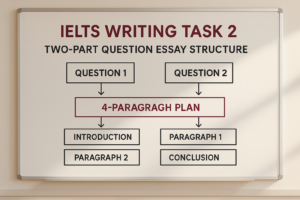
A reliable answer has four short paragraphs. The introduction paraphrases the task. The overview summarises the main patterns. The first detail paragraph describes the largest or most important group. The second detail paragraph covers the remaining comparisons.
This structure works because it keeps the report readable. The examiner sees the overview before the detailed numbers, and each body paragraph has a clear purpose. You avoid the common problem of writing a long list of disconnected facts.
For broader Task 1 training, use the IELTS Writing Task 1 practice test after studying this model so you can apply the same structure to line graphs, tables, maps, and mixed charts.
Sample Bar Chart Task
Imagine the bar chart compares the percentage of people in three age groups who used four online services in 2025: online banking, streaming, online shopping, and online learning. The age groups are 18 to 29, 30 to 49, and 50 and over.
In this sample, streaming is highest among 18 to 29-year-olds at 90%, while online banking is highest among 30 to 49-year-olds at 82%. The 50 and over group uses online banking at 65%, online shopping at 50%, streaming at 42%, and online learning at 25%. Online learning is the least popular service in every age group.
This task is typical because there are several ways to organise the answer. You could group by age, by service, or by the strongest contrasts. A Band 7 answer chooses the grouping that makes the main message easiest to follow.
Band 7 Model Answer
The bar chart compares the proportions of people in three age groups who used four different online services in 2025.
Overall, younger adults were the most likely to use streaming and online learning, while online banking was most common among people aged 30 to 49. Online learning had the lowest participation in all three age groups.
Among 18 to 29-year-olds, streaming was the most popular service, at 90%. Online shopping was also widely used in this group, at 76%, while online banking stood slightly lower at 70%. By contrast, only 48% of younger adults used online learning, although this was still higher than the figures for the older groups.
For people aged 30 to 49, online banking recorded the highest figure, at 82%, followed by online shopping at 72% and streaming at 68%. The oldest group showed a different pattern. Online banking remained relatively common at 65%, but online shopping fell to 50% and streaming to 42%. Online learning was least popular among those aged 50 and over, at just 25%.
Why This Model Reaches Band 7
The model answer reaches Band 7 because it does not simply list the bars. The overview identifies the main pattern: younger adults lead in streaming and learning, middle-aged adults lead in banking, and online learning is lowest overall. That gives the report a clear direction.
The details are grouped logically. The first body paragraph focuses on the youngest group because it has the highest streaming figure and a stronger online learning result. The second paragraph compares the two older groups and shows how use drops for some services.
The figures are selective. The answer includes enough data to prove the comparisons, but it does not turn every sentence into a number dump. If you want to test this under timed conditions, access unlimited IELTS mock tests and review whether your Task 1 answers include a clear overview and grouped details.
How To Write The Introduction
The introduction should paraphrase the chart in one clean sentence. You can change shows to compares, percentage to proportion, and people to users or participants. Do not add opinions, reasons, or predictions.
A strong introduction is usually short. It names the chart type, the subject, the categories, and the time if there is one. It should prepare the reader for the report, not carry the main analysis.
Avoid copying the task word for word. Small, accurate changes are enough. Over-paraphrasing can create awkward or incorrect language, which is not worth the risk.
How To Write The Overview
The overview is the most important paragraph. For a bar chart, look for the highest bar, the lowest bar, the biggest contrast, any similar figures, and any pattern across groups. You do not need exact numbers in the overview unless they are essential.
In the sample task, the overview should mention that streaming is strongest among younger adults, banking is strongest among the 30 to 49 group, and online learning is lowest in every age group. Those are the main features.
Do not write small details in the overview. The overview should tell the examiner what the chart is mainly about. The body paragraphs can then support that summary with selected figures.
Choosing Details For Body Paragraphs
Good detail selection is what separates a report from a list. Start by choosing the most useful grouping. If the chart has age groups, you may group by age. If it has countries, you may group similar countries together. If it has categories with very different values, group the high and low figures.
Then choose the figures that prove the main comparisons. In the sample chart, 90% for streaming among young adults is important because it is the highest figure. The 25% figure for online learning among older adults is also important because it is the lowest.
If the chart has many bars, do not mention every value. For more help with selection and report structure, read the IELTS Writing Task 1 tips and strategies guide.
Comparison Language For Band 7
Band 7 comparison language is clear and accurate. Useful phrases include higher than, lower than, the highest proportion, the lowest figure, slightly more, considerably less, almost double, about half, followed by, respectively, and by contrast.
Use respectively only when the order is very clear. For example, online banking and shopping stood at 82% and 72%, respectively. If the sentence is crowded, use simpler wording instead.
Do not overload the answer with dramatic language. A difference from 70% to 72% is slight. A difference from 90% to 25% is substantial. Your vocabulary must match the data.
Grammar Patterns That Help Your Score
Bar charts allow you to show range through comparison clauses. You can write: streaming was more popular among younger adults than among the oldest group. You can also use while: online banking was highest among 30 to 49-year-olds, while online learning was lowest in every group.
Another useful pattern is followed by. For example, online banking was followed by online shopping and streaming. This helps you describe ranking without repeating the same sentence shape.
Accuracy matters more than complexity. If a sentence becomes too long, split it. Band 7 writing is controlled, not complicated for its own sake.
Common Mistakes In Bar Chart Answers
The first mistake is missing the overview. Without an overview, Task Achievement is limited, even if the details are accurate. The second mistake is describing bars one by one without comparisons. IELTS wants a summary, not a data inventory.
The third mistake is using numbers without units. If the chart uses percentages, include percent or percentage points where needed. The fourth mistake is inventing reasons. Unless the chart gives causes, do not explain why older people used streaming less often or why banking was popular.
The fifth mistake is writing too much. Task 1 should be efficient. If your timing is weak, see our IELTS preparation plans and choose support that helps you build a realistic Writing routine.
A 20-Minute Practice Routine
Use the first two minutes to read the title, labels, units, categories, and time period. Then spend two minutes choosing the overview and deciding how to group the bars. This planning time prevents a messy report.
Use about twelve minutes to write the introduction, overview, and two body paragraphs. Keep each paragraph focused. If a sentence does not compare or support a main feature, it probably does not belong.
Save the final two minutes for checking. Look for subject-verb agreement, missing articles, wrong prepositions, inaccurate comparison words, and inconsistent use of percent. Small corrections can protect marks.
Final Checklist Before You Submit
Before you finish a bar chart report, check that your introduction paraphrases the task, your overview identifies the main patterns, your body paragraphs are grouped logically, and your data supports the overview.
Also check that you did not repeat the post title as a heading, did not give personal opinions, and did not invent causes. A Task 1 answer should sound like a concise report.
An IELTS Writing Task 1 Bar Chart band 7 model is useful when you copy the thinking, not just the wording. Read the chart, choose the story, group the bars, compare the right figures, and write in clean controlled English.
Ready to find out your IELTS band score?
Take the IELTS Express Pre-Test for just $4.99 and get your personalised band prediction with a 14-day improvement plan.
FAQ: IELTS Writing Task 1 Bar Chart Band 7 Model
How do I write a Band 7 IELTS bar chart answer?
Use four paragraphs: introduction, overview, first detail paragraph, and second detail paragraph. Focus on the biggest comparisons and support them with selected figures.
What should the overview include in a bar chart?
The overview should include the highest and lowest categories, the biggest contrasts, and any clear pattern across groups. Avoid listing every number in this paragraph.
How many figures should I include in Task 1?
Include enough figures to support the main comparisons. You usually need the highest, lowest, and several important supporting values, but not every bar.
Can I explain reasons for the bar chart results?
No. Unless the chart directly gives causes, do not speculate. IELTS Writing Task 1 requires a factual summary of the visual information.
How long should a bar chart answer be?
A strong answer is often around 170 to 210 words. You need at least 150 words, but writing too much can waste time and increase grammar risk.