If you are looking for IELTS Writing Task 1 Vocabulary For Graphs sample answer practice, the real goal is not to memorise impressive words. The goal is to describe data accurately, choose the right verbs for movement, and compare key figures without sounding mechanical. Before you keep writing full reports without knowing your current level, take the IELTS Express Pre-Test to check your likely band range and see whether Writing Task 1 is one of the areas holding you back.
Task 1 graph vocabulary is useful only when it helps the examiner understand the visual. A strong report does not use every synonym in your notebook. It selects the biggest trends, groups similar information, and uses precise language for increases, decreases, stability, peaks, lows, proportions, and comparisons. This guide gives you a practical vocabulary system and a sample answer you can study line by line.
IELTS Writing Task 1 Vocabulary For Graphs Sample Answer: What Examiners Want
In Academic Writing Task 1, examiners are not looking for decoration. They want a clear summary of the main features and accurate support from the data. Vocabulary matters because it helps you describe those features efficiently. If the graph shows a steady rise, say that. If it shows a sharp fall, say that. If two categories are similar, compare them directly.
The strongest candidates use vocabulary to organise meaning. They do not write a separate sentence for every number. They notice which figures matter and connect them with sensible language. That is why words such as rose, fell, remained stable, peaked, accounted for, exceeded, and was approximately are more useful than rare words that do not fit the chart.
- Use movement verbs for line graphs and time-based bar charts.
- Use comparison language when two or more categories differ.
- Use proportion language for pie charts and percentage visuals.
- Use approximation when exact figures are not necessary.
- Use overview vocabulary to summarise the biggest pattern.
Core Vocabulary For Increases And Decreases
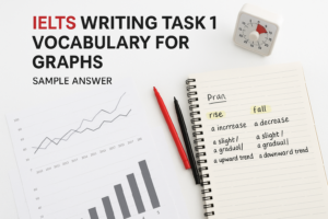
The basic verbs for upward movement are rise, increase, grow, climb, and go up. For IELTS, rise and increase are usually the safest choices because they are neutral and academic. Grow can work for populations, sales, income, and other quantities that naturally expand. Climb is useful, but it can sound slightly less formal if overused.
For downward movement, use fall, decrease, decline, drop, and go down. Decrease and decline are safe academic choices. Drop is useful when the fall is noticeable or sudden. Avoid using too many different verbs just to show range. Range is good, but accuracy is better. If you are unsure, choose the simplest correct verb.
You can strengthen these verbs with adverbs. For example, prices rose sharply, numbers increased gradually, sales fell slightly, and participation declined steadily. The adverb should match the visual. Do not write sharply if the graph shows a small, slow change.
Vocabulary For Speed And Size Of Change
Task 1 often requires you to describe not only the direction of change, but also the speed or size of that change. For large changes, use significant, substantial, dramatic, sharp, or considerable. For small changes, use slight, modest, marginal, or minimal. For slow changes, use gradual or steady. For fast changes, use rapid or sudden.
These words are powerful because they let you compare trends without listing every number. For example, you might write that online sales rose dramatically, while store sales increased only slightly. That one comparison gives the examiner a clearer picture than two disconnected figures.
If you want to test this under timed conditions, access unlimited IELTS mock tests and practise writing Task 1 reports with strict 20-minute limits. Vocabulary is easier to use in the real exam when you have already practised it against the clock.
Vocabulary For Stability And Small Movement
Not every graph changes dramatically. Sometimes the most important feature is stability. Useful phrases include remained stable, stayed constant, levelled off, fluctuated slightly, showed little change, and remained broadly unchanged. These phrases help you avoid forcing movement where the data is mostly flat.
For example, if the percentage moves from 42% to 43% and then back to 42%, it is not accurate to say it rose and fell dramatically. A better sentence is: The figure remained broadly stable at just over 40% throughout the period. That sentence is shorter, cleaner, and more accurate.
Fluctuate is useful when the line moves up and down several times. However, do not use it for one simple rise and fall. Examiners notice when vocabulary is used because it sounds advanced rather than because it describes the chart.
Vocabulary For Peaks, Lows, And End Points
Graphs often include important high and low points. Useful phrases include reached a peak of, peaked at, hit a low of, fell to its lowest point, and ended the period at. These phrases are especially useful in line graphs because they help you highlight the most important moments in the data.
For example, you could write: The number of visitors peaked at 2.4 million in 2020 before falling slightly in the final year. This sentence gives a high point, a date, a figure, and a later trend. It is much stronger than writing three separate sentences for 2019, 2020, and 2021.
Be careful with peak. It means the highest point, not just a high number. If a figure rises from 30 to 40 and then reaches 50 at the end, it peaked at 50. Do not say it peaked at 40 if it continued to rise afterwards.
Comparison Vocabulary For Graphs
Comparison is central to Task 1. Useful phrases include higher than, lower than, more than twice as high as, roughly the same as, slightly below, far above, exceeded, overtook, was the largest category, and accounted for the smallest share. These phrases help you connect data instead of writing a list.
For example, instead of writing, The figure for cars was 60%. The figure for buses was 25%, you could write: Cars accounted for 60%, which was more than twice the share for buses. That sentence is more analytical and shows stronger control of comparison language.
Do not overuse complex comparison structures. A sentence like more than three times as high as is useful only when the data supports it. If the difference is small, use slightly higher than or marginally lower than. Precision is what makes vocabulary useful.
Sample Graph Task And Model Answer
Task: The line graph shows the percentage of households in one country using three types of internet connection between 2016 and 2024: fibre, mobile broadband, and dial-up.
Sample answer: The line graph compares the proportion of households using fibre, mobile broadband, and dial-up internet from 2016 to 2024.
Overall, fibre became the dominant connection type by the end of the period, while dial-up declined sharply and almost disappeared. Mobile broadband increased at first, but its growth was more moderate and it levelled off in the final years.
In 2016, fibre was used by only 18% of households, compared with 42% for dial-up and 25% for mobile broadband. Fibre then rose steadily to 35% in 2019 before increasing more rapidly and reaching 68% in 2024. By contrast, dial-up fell every year, dropping from 42% to 20% by 2020 and then declining further to just 4% at the end of the period.
Mobile broadband showed a different pattern. It climbed gradually from 25% in 2016 to 36% in 2021, overtaking dial-up in 2019. After that, it remained broadly stable, ending the period at 38%. By 2024, fibre was almost twice as common as mobile broadband and far ahead of dial-up.
Why This Sample Answer Works
The sample answer works because it does not describe every data point. It begins with a paraphrase of the task, then gives an overview of the biggest trends. The body paragraphs group the information logically: fibre and dial-up are compared because they move in opposite directions, while mobile broadband is described separately because it rises and then stabilises.
The vocabulary is useful but controlled. The answer uses rose steadily, increased more rapidly, declined sharply, levelled off, overtaking, broadly stable, and almost twice as common. These phrases match the data. They are not inserted randomly to sound advanced.
The answer also includes figures only when they support a key trend. This is important for Task Achievement. A report with no numbers feels vague, but a report with every number becomes a list. The best answer chooses enough data to prove the summary.
Common Vocabulary Mistakes In Task 1 Graphs
The first common mistake is using nouns and verbs incorrectly. You can write sales increased or there was an increase in sales. Do not write sales had an increase sharply. If you use a verb, pair it with an adverb: increased sharply. If you use a noun, pair it with an adjective: a sharp increase.
The second mistake is using by and to incorrectly. If the figure moved from 20% to 50%, it increased to 50% and increased by 30 percentage points. To gives the final number. By gives the amount of change. This small grammar point can affect clarity in many graph reports.
The third mistake is exaggeration. If a figure changes from 51% to 53%, do not call it a dramatic rise. Say it rose slightly or remained fairly stable. IELTS rewards accurate description, not overstatement. For a wider Task 1 method, the IELTS Writing Task 1 tips and strategies guide is a useful next step.
How To Build A Flexible Vocabulary Bank
A useful vocabulary bank should be organised by function, not by topic alone. Create sections for upward trends, downward trends, stability, comparison, approximation, proportions, and overview language. Then practise writing short sentences from charts rather than memorising isolated words.
For example, do not only write the word decline in your notebook. Write a full sentence: The percentage of commuters using buses declined gradually from 34% to 27%. This teaches you the grammar around the word. It also helps you avoid mistakes with prepositions, articles, and tense.
You can also keep a small correction list. After each Task 1 report, write down three vocabulary or grammar errors you made. Over time, this becomes more valuable than a long list of words you never use. If you need structured feedback, see our IELTS preparation plans and choose support that targets Writing correction.
A 20-Minute Practice Routine
Use a simple routine. Spend three minutes reading the graph and choosing the biggest features. Spend two minutes planning the overview and paragraph grouping. Spend 13 minutes writing. Keep the final two minutes for checking vocabulary, numbers, tense, and comparison grammar.
During the check, look for five things. Did you include a clear overview? Did you use at least two comparisons? Did you describe movement accurately? Did you include enough figures? Did you avoid repeating the same verb in every sentence? This quick check can prevent many avoidable errors.
The IELTS Writing Task 1 sample answers page can help you compare your report structure with stronger models. Read samples actively: underline the overview, circle comparison phrases, and notice how many numbers are actually used.
Final Checklist Before You Use Graph Vocabulary
Before using a phrase, ask whether it is accurate, necessary, and grammatically controlled. Accurate means it matches the visual. Necessary means it helps explain the main feature. Controlled means you can use it without creating a grammar problem. A simple correct phrase is better than an ambitious incorrect one.
For most candidates, the fastest improvement comes from using fewer words better. Learn a small set of reliable verbs, adverbs, comparison phrases, and overview structures. Then practise them with different charts until they feel natural. That is how vocabulary becomes part of your writing skill rather than a list you try to remember under pressure.
The best Task 1 reports are clear, selective, and measured. They help the reader see the graph quickly. If your vocabulary does that, it is doing its job.
Ready to find out your IELTS band score?
Take the IELTS Express Pre-Test for just $4.99 and get your personalised band prediction with a 14-day improvement plan.
FAQ: IELTS Writing Task 1 Vocabulary For Graphs Sample Answer
What vocabulary is useful for IELTS Writing Task 1 graphs?
Useful vocabulary includes verbs for movement, such as rose, fell, increased, declined, remained stable, peaked, and fluctuated, plus comparison phrases such as higher than, lower than, accounted for, and more than twice as high as.
Can I memorise graph vocabulary for Task 1?
You can memorise useful phrases, but you must practise using them accurately with real charts. Memorised vocabulary can lower your score if it does not match the data or creates grammar errors.
How many different words should I use for increase and decrease?
You only need a small reliable range. Rise, increase, grow, fall, decrease, decline, and drop are enough for many reports if you use them accurately with suitable adverbs and figures.
What is the difference between increased by and increased to?
Increased to gives the final figure. Increased by gives the amount of change. If a figure moved from 20% to 50%, it increased to 50% and increased by 30 percentage points.
Does vocabulary affect my IELTS Writing Task 1 band score?
Yes. Vocabulary affects Lexical Resource, but it also supports Task Achievement because accurate words help you describe trends, comparisons, and main features clearly.