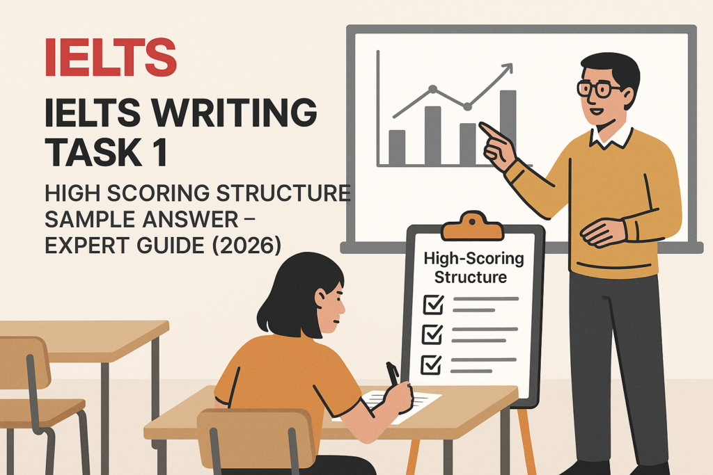
IELTS Writing Task 1 High Scoring Structure sample answer practice is useful because many candidates know the vocabulary, but still lose marks through weak organisation. A high-scoring Task 1 report is not a list of numbers. It is a controlled explanation of the main features, supported by selected data. Before you keep writing full reports without knowing where you stand, take the IELTS Express Pre-Test to check your current band range and see whether Writing Task 1 is one of the areas pulling your score down.
The structure you use in Task 1 matters because the examiner needs to see your overview, comparisons, and supporting figures quickly. If your report is accurate but scattered, the score can suffer. If your report is organised but too vague, the score can also suffer. This guide gives you a practical structure, a high-scoring sample answer, and a breakdown of how each paragraph works.
IELTS Writing Task 1 High Scoring Structure Sample Answer: The Core Pattern
A strong Academic Task 1 answer usually has four paragraphs. The first paragraph paraphrases the question. The second paragraph gives the overview. The third and fourth paragraphs describe the key details in logical groups. This structure is simple, but it works because it matches what the examiner is looking for.
The overview is the most important paragraph. It should identify the biggest trends, highest or lowest categories, major changes, or most obvious comparisons. It should not include every number. The detail paragraphs then support that overview with selected figures.
- Paragraph 1: paraphrase the task in one clear sentence.
- Paragraph 2: give an overview of the main features.
- Paragraph 3: describe the first logical group of details.
- Paragraph 4: describe the second logical group of details.
- Keep the report factual, formal, and data-led.
Why Structure Affects Your Task 1 Band Score
Task 1 is assessed across task achievement, coherence and cohesion, lexical resource, and grammar. Structure directly affects the first two criteria. If the overview is missing or unclear, task achievement is limited. If the details are not grouped logically, coherence and cohesion become weaker.
Good structure also protects grammar and vocabulary. When you know what each paragraph must do, you write fewer rushed sentences. You are less likely to repeat the same phrase or describe figures in a random order. A clear structure gives you more mental space to choose accurate verbs, comparisons, and numbers.
If you want to practise this under exam pressure, access unlimited IELTS mock tests and write Task 1 reports in exactly 20 minutes. Structure only becomes reliable when you can use it under time pressure.
The Four-Paragraph Structure Explained
The introduction should be short. You do not need background knowledge, opinions, or reasons. If the question says the chart shows the percentage of people using different transport types in a city between 2000 and 2020, your introduction should simply restate that in your own words.
The overview should come next. Some teachers place it at the end, but putting it after the introduction is usually safer because the examiner sees it early. Use phrases such as overall, it is clear that, the most noticeable feature is, or in general. Then summarise the main pattern.
The detail paragraphs should be grouped by meaning. For a line graph, you might group upward trends in one paragraph and downward or stable trends in another. For a bar chart, you might group the highest categories together and compare the lower categories separately.
Sample Task For The High Scoring Structure
Imagine a line graph showing the percentage of commuters in a city who used cars, buses, bicycles, and trains from 2000 to 2020. Cars started at 55% in 2000 and fell to 40% by 2020. Train use increased from 15% to 30%. Bicycle use rose from 5% to 15%. Bus use declined from 25% to 15%.
This is a typical Task 1 situation because there are several categories and a time period. The answer should not describe every five-year point. It should identify the main changes: car use fell but remained highest, trains and bicycles became more popular, and buses declined.
When you plan, write a quick note for the overview before you start the full answer. For example: cars highest but down; trains up strongly; buses down; cycling up from low base. Those notes are enough to guide the report.
High Scoring Sample Answer
The line graph compares the proportion of commuters in one city who travelled by car, bus, bicycle, and train between 2000 and 2020.
Overall, car travel remained the most common form of commuting throughout the period, although its share fell noticeably. By contrast, train and bicycle use increased, while bus travel became less popular.
In 2000, cars accounted for 55% of commuter journeys, which was more than double the figure for buses at 25%. However, the proportion of people travelling by car declined steadily over the next two decades, reaching 40% in 2020. Bus use followed a similar downward pattern, falling from 25% to 15% over the same period.
The two remaining modes showed growth. Train use doubled from 15% in 2000 to 30% in 2020, making it the second most common form of transport by the end of the period. Bicycle commuting also rose, increasing from just 5% to 15%. Although cycling remained less common than car and train travel, its share tripled over the twenty years.
Why This Sample Answer Works
The sample answer works because it is selective. It does not try to mention every possible detail. It introduces the chart, gives a clear overview, then divides the details into declining transport types and growing transport types. That grouping makes the report easy to follow.
The overview is also strong because it explains the main story without numbers. It tells the examiner that car travel stayed highest but declined, train and bicycle use rose, and bus use fell. The details then prove those points with figures.
The language is not complicated. Phrases such as remained the most common, fell noticeably, doubled, followed a similar downward pattern, and by the end of the period are useful because they describe the data accurately. High-scoring Task 1 writing is clear before it is impressive.
How To Write The Introduction
The introduction should paraphrase the task. Do not copy the question word for word if you can avoid it. Replace shows with compares, percentage with proportion, and people who travelled by with commuters who used. These small changes are enough.
A safe introduction begins with: The chart compares… or The graph shows changes in… You can usually write it in one sentence. Avoid adding opinions, causes, or predictions because Task 1 asks you to report the data, not explain why it happened.
For more practice with wording, review the IELTS Writing Task 1 vocabulary list and focus on phrases that help you paraphrase clearly.
How To Write A Strong Overview
The overview should summarise the biggest features. Ask yourself three questions: What is highest or lowest? What changes most? What stays the same? If you answer those questions, you usually have enough for a clear overview.
Do not put too many numbers in the overview. Numbers belong mainly in the detail paragraphs. The overview should be broad. For example, instead of writing that car use fell from 55% to 40%, write that car use declined but remained the dominant mode of transport.
A weak overview says the graph changed over time. That is too general. A stronger overview names the actual direction of change and the most important comparison. This is one of the easiest ways to lift a Task 1 answer.
How To Group The Details
Grouping is where many candidates lose control. They describe category A from start to finish, then category B, then category C, without showing the relationship between them. A better approach is to group similar patterns together.
In the sample answer, car and bus use are grouped because both declined. Train and bicycle use are grouped because both increased. This creates two clean detail paragraphs. The reader can see the contrast between falling and rising categories.
For bar charts, you might group the largest figures together and then compare the smaller figures. For pie charts, group the major segments and mention smaller segments briefly. For process diagrams, group the stages into phases rather than writing a long chain of disconnected steps.
Vocabulary For A High Scoring Structure
Useful structure vocabulary includes overall, in contrast, respectively, whereas, while, by comparison, over the period, by the end of the period, accounted for, stood at, rose to, fell to, and remained stable. These phrases help connect data without making the writing sound forced.
Use vocabulary accurately. If a figure moves from 20% to 22%, do not say it rose dramatically. If it moves from 20% to 60%, a significant increase is more suitable. Accuracy matters more than variety.
If you are still unsure whether your reports are organised clearly, see our IELTS preparation plans and choose support that includes Writing Task 1 feedback.
Common Structure Mistakes To Avoid
The first mistake is missing the overview. Without a clear overview, the answer cannot fully satisfy the task. Even if the detail paragraphs are accurate, the report feels incomplete.
The second mistake is writing too much in the introduction. Candidates sometimes explain the topic or add background information. That wastes time and does not improve the score. Keep the introduction short and move quickly to the overview.
The third mistake is listing data in the order it appears without grouping it. IELTS reports need organisation, not just description. If two categories follow the same pattern, put them together. If one category is clearly different, contrast it directly.
A 20-Minute Writing Plan
Spend the first three minutes analysing the visual and planning the overview. Write down the biggest trend, the highest or lowest category, and one logical grouping. Do not start writing until you know the overview.
Spend about two minutes on the introduction and overview. Then spend ten to twelve minutes on the two detail paragraphs. Leave the final three minutes to check grammar, numbers, spelling, and whether the overview is visible.
This timing prevents the common problem of writing a long introduction and rushing the important details. The report only needs at least 150 words, so clarity is more important than length.
Final Checklist Before You Submit Task 1
Before you finish, check that your report has four clear paragraphs. Make sure the overview is easy to find and does not simply repeat the introduction. Check that every number you include supports a main feature.
Also check that your grammar matches the time period. If the graph covers 2000 to 2020, use past tense. If it includes predictions to 2040, use future forms for projected figures. If it shows a current comparison with no time period, present simple may be correct.
For broader writing preparation, the IELTS Writing Task 1 sample answers guide can help you compare structure across different chart types.
Ready to find out your IELTS band score?
Take the IELTS Express Pre-Test for just $4.99 and get your personalised band prediction with a 14-day improvement plan.
FAQ: IELTS Writing Task 1 High Scoring Structure Sample Answer
What is the best structure for IELTS Writing Task 1?
A safe structure is four paragraphs: introduction, overview, first detail paragraph, and second detail paragraph. This makes the overview clear and keeps the data grouped logically.
Should the overview come after the introduction?
Yes, this is usually the safest choice. Placing the overview after the introduction helps the examiner see the main features early in the report.
How many numbers should I include in Task 1?
Use enough numbers to support the main features, but do not list every figure. Most reports need selected start, end, high, low, or comparison figures.
Can I use the same Task 1 structure for every chart?
You can use the same basic four-paragraph structure for most charts, but the way you group the details should change depending on the visual.
What makes a Task 1 answer high scoring?
A high-scoring answer has a clear overview, logical grouping, accurate data selection, precise vocabulary, and controlled grammar. It reports the data without opinions or unnecessary explanation.